As a typeface designer, I enjoy collecting old Chinese print publications. One rather unique category of collectibles are the “meishuzi manuals” produced from the 1950s to the ’70s by well-known publishing houses or local cultural organs across China.
Most of these pocket-sized, landscape-oriented books follow a similar structure: The first half introduces the basic principles of modeling Chinese characters, along with tools and techniques for painting meishuzi characters, while the second half presents samples for use on different occasions. They were designed to meet the strong demand for writing manuals in the early days of the People’s Republic of China, especially for things like warning signs and political slogans that were plastered across large surfaces such as walls.
But what exactly are meishuzi? The three-character term is difficult to translate and often misunderstood. The first two characters, meishu, are a combination borrowed from Japanese Kanji more than a century ago and could be translated literally as “fine art.” However, meishuzi, or “fine art Chinese characters,” have largely served a decorative and graphic, rather than artistic, purpose.
Rather, the meishu in meishuzi is closer to its meaning in meishuke – or “art classes.” Found in every Chinese primary and secondary school, these classes are designed to teach students to pick up a brush and to write or draw, not to create something artistically unique. The key to meishuzi therefore does not lie in any particular aesthetic, but rather in the method and action of writing. It’s a lettering that is inextricably linked to its place of use and the tools required to produce it — a large-scale flat surface, a straightedge, a compass and a paintbrush.
Relative to China’s long history of writing and printing, meishuzi is a relatively new concept: Instead of writing with a thin brush, the practice of forming large characters using straightedge, compass and paint only entered widespread use in the early 20th century. At the time, the rapid development of media and consumer markets created rising demand for designs to be used on book covers and in advertising, prompting designers to experiment with new, eye-catching character forms. The meishuzi produced during the Republic of China period (1912-1949), for example, often boldly deformed the strokes of characters for dramatic effect.
The founding of the People’s Republic in 1949 brought new ideologies — and with them, new approaches to writing. Markets were replaced by a planned economy, and the flashy Republican-era commercial meishuzi disappeared, criticized as relics of capitalism that were out of touch with the public and incompatible with the socialist values.
This attitude can be traced back to a famous speech given by Mao Zedong in 1942 to the Yan’an Forum on Literature and Art, at which he said: “All our literature and art are for the masses of the people, and in the first place for the workers, peasants and soldiers; they are created for the workers, peasants and soldiers and are for their use.” And the art of lettering — vital to spreading political messages — was no exception. At a time when the majority of China’s population was illiterate, the non-standard characters popular during the Republican era were obviously not fit for use. Instead, a new, more easily legible lettering was needed for mass accessibility.
Perhaps the most visible example of meishuzi from this period is the pair of large slogans displayed on either side of Chairman Mao’s portrait at Tiananmen Square, which reads: “Long Live the People’s Republic of China” and “Long Live the Great Unity of the World’s Peoples.” Originally featuring traditional Chinese characters and a slightly different message, the 2-meter square characters were hand-painted by an artist before then being turned into signs.
Other, less well-known meishuzi borrowed from the blocky Heiti typeface, as well as ancient calligraphy and tablet inscriptions, which provided inspiration for their bold, eye-catching strokes. These meishuzi were used not only on buildings and walls to display political slogans, but also to display important safety messages such as “No Fires Allowed” in factories, as well as in road names and bus stops.
Although book covers offered slightly more room for experimentation than warning signs or political slogans, most publications before the 1970s were focused on political beliefs and topics like science and technology. Sometimes, designers would also add decorative elements to affect a more relaxed and lively style, but situations where “creative” meishuzi were deemed suitable were relatively rare. Even for less serious themes such as the Children’s Day, typefaces were restrained, and the strokes much less exaggerated than those found in designs from the Republican period.
The late 1970s brought the advent of reform and opening and the revival of market economy. New commodities and advertisements placed greater emphasis on individuality and originality; designers began reviving the flashy, eye-catching meishuzi of the Republican era. One example of this trend is the Zongyi typeface, for which designer Kwok Ping Kuen drew inspiration from Republican-era meishuzi — and which remains popular more than 40 years later. These designs transported readers back to the glitz and glamour of 1920s Shanghai. By contrast, the meishuzi used to write slogans during the 1950s and ’70s fell into disuse, often dismissed as a relic of a bygone era.
However, that’s not to say socialist-era meishuzi have no artistic or aesthetic value. Just like their Republican-era counterparts, slogan-themed meishuzi can quickly transport you back to a certain time and place. In the same way that it’s hard to imagine the slogans that adorn the Tiananmen Gate being written in a fancier font, the use of meishuzi lettering in TV dramas such as “The Three-Body Problem” immediately evokes memories of the Cultural Revolution. Similarly, visitors to the northeastern city of Daqing, a high-socialist oil town not far from where I was born, will find meishuzi plastered everywhere, from factories and schools to hospitals.
More curiously, slogan meishuzi also proved valuable as a reference for the development of Chinese fonts on computers. Because they must combine uniformity, visual appeal and a certain amount of originality, these characters often share the same design principles as digital typefaces.
The task of creating Chinese characters that look dignified and legible is not easier than creating whimsical, outlandish characters. If anything, the overall uniformity of slogan meishuzi might make individual artists’ unique flourishes even more noticeable. In one meishuzi manual I own dating from the 1970s, I came across a slogan written in extremely bold Heiti lettering, with thick strokes ending in subtle flares that manage to seem both solid and graceful. The message — “Industry Learns from Daqing, Agriculture Learns from Dazhai” — might be dated, but its design is timeless.
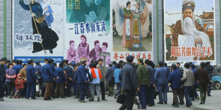
(Header image: Film posters on display in Shanghai, 1979. VCG)


GIPHY App Key not set. Please check settings